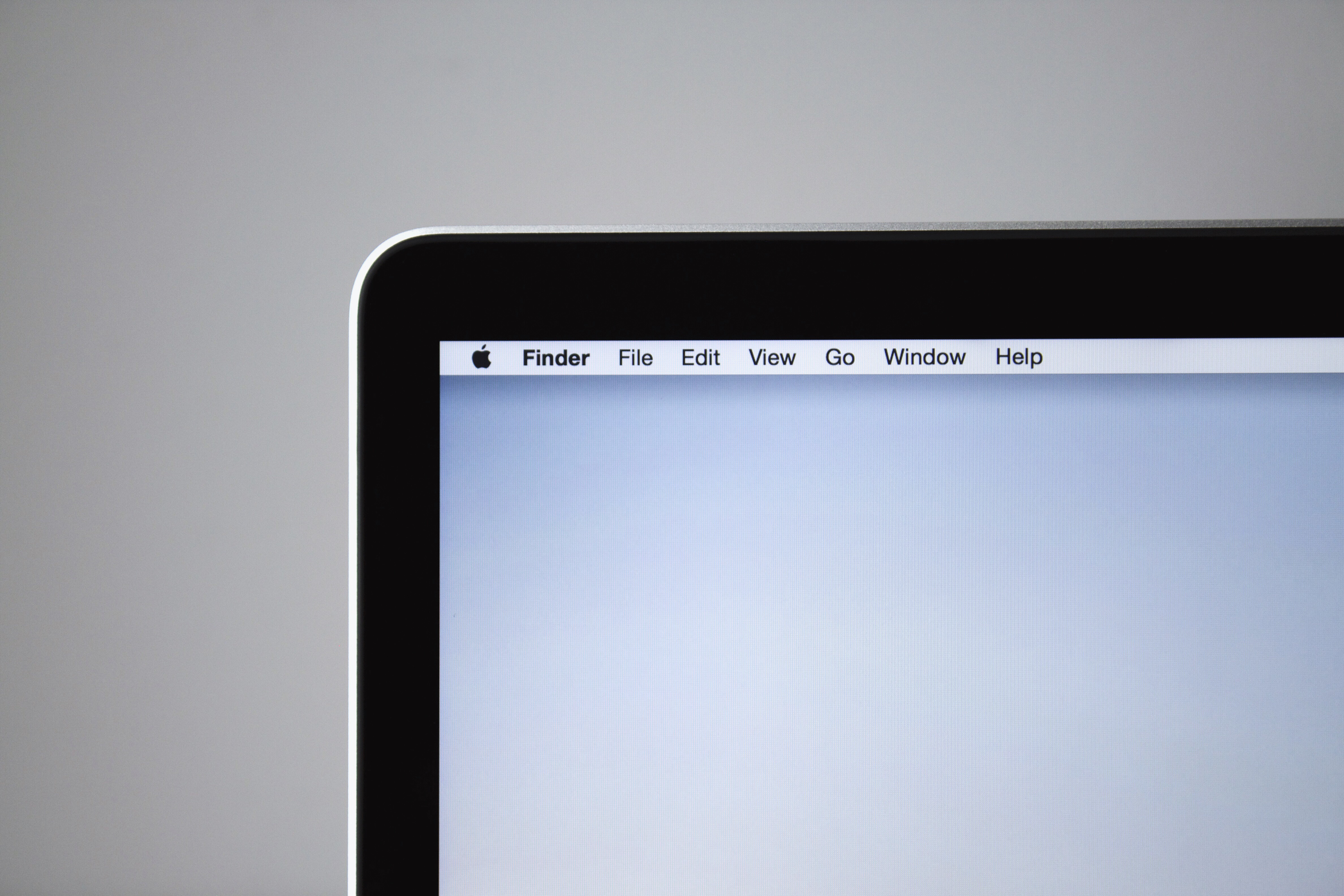
The MacBook Pro
Early last week, amidst Apple’s recent reveal-slash-revival of the original MacBook lineup, I bought myself a MacBook Pro — and goodness, this thing is beautiful.
Actually, I’ve been meaning to buy myself a laptop ever since I started Uni (yes, it’s my first year, but more on that in another blog post sometime later). I needed a portable powerhouse to work on while out and about, so I wouldn’t have to rush home and rely on my iMac had my laptop been a low-end model. And since I’m now studying Computer Science, it’s important that a lot of my work has to be with me all the time.
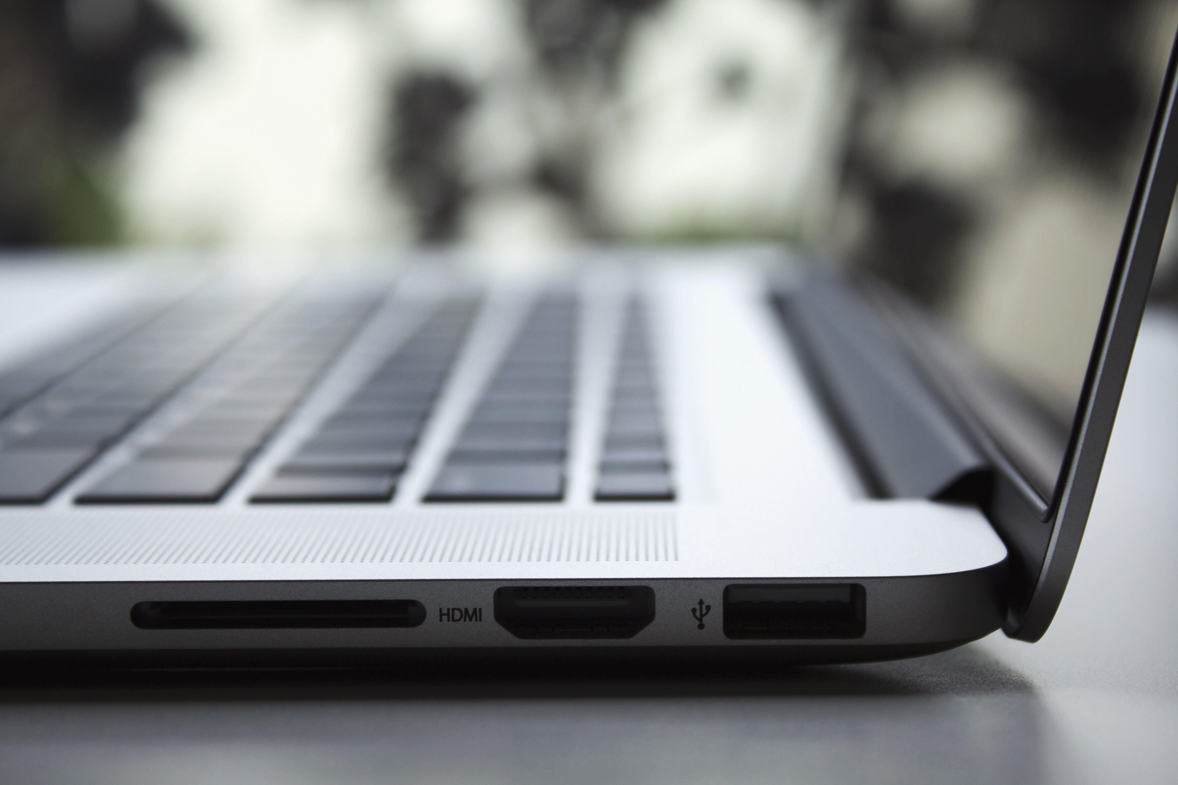
Before the keynote, I’ve been cautiously following along rumours and leaks just in case Apple would announce anything out of the ordinary. The new ultra-thin MacBooks are something special, however their poor specifications merely reaffirmed my preference for the more robust MacBook Pro.
And so, I got the high-end 15” MacBook Pro. Here are its specifications:
- MacBook Pro (Retina, 15-inch, Mid-2014)
- 2.5GHz Intel Core i7
- 16 GB 1600 MHz DDR3
- 512GB of SSD Flash Storage
- NVIDIA GeForce GT 750M 2048 MB

Besides the technology inside, what really sold the Pro to me was its gorgeous new Retina Display. At twice the pixels on screen, everything looks so beautiful — especially OS X Yosemite. I’m yet to do any proper design work on this screen, although I have tested and tried it out: switching from working on a non-Retina display, it’s much harder to see improperly aligned-pixels and so pixel-hinting on this can be troublesome. (Perhaps there are other methods out there I’m yet to discover.)
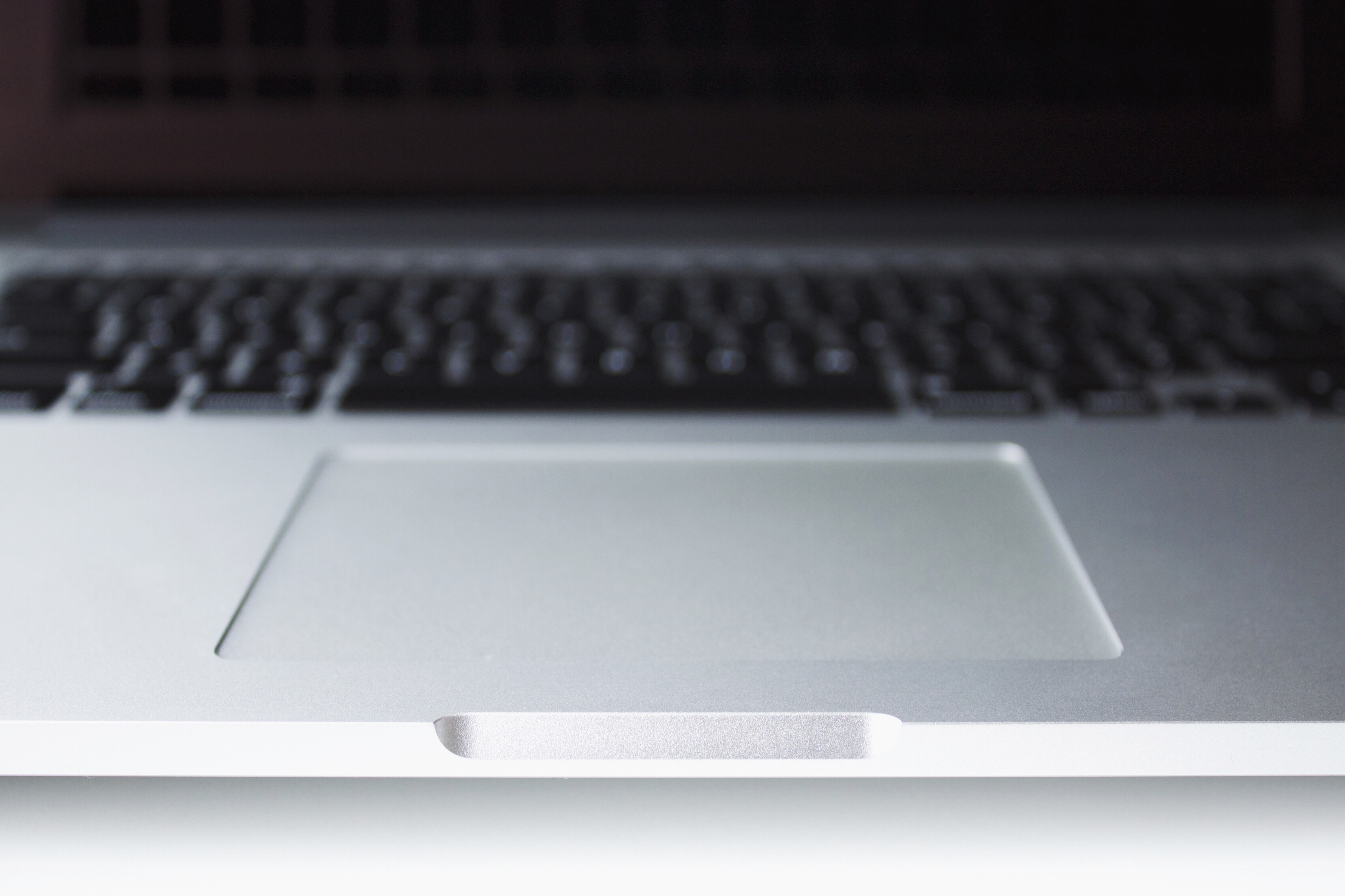
Although, at first glance, the new Retina Display MacBook Pro seems a lot similar to previous designs, this thinner new look is a refinement over the last. This MacBook is a lot more minimalist, and one of my favourite enhancements from the last design is the new look and feel of the lid indent. While using the trackpad, the lid indent is where my thumb will sit the majority of the time. On this MacBook, the indent is smoother and flatter, and more comfortable to rest on.
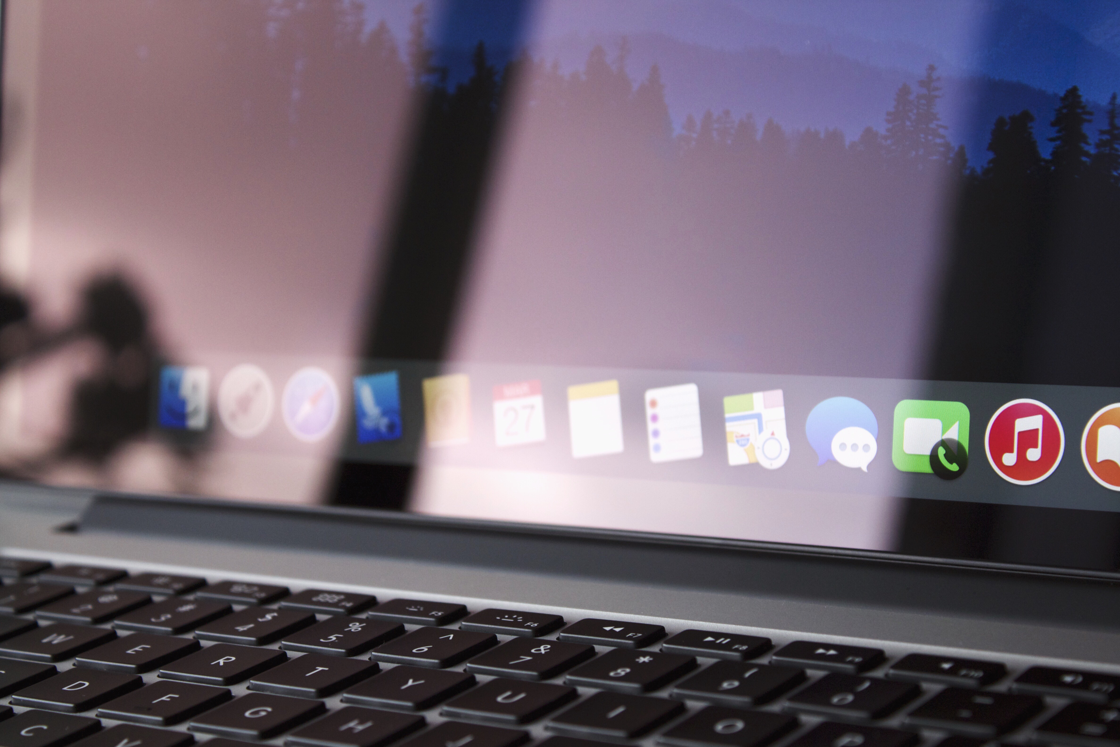
Another refinement is Apple’s removal of the ‘MacBook Pro’ label on the bevel of the display. The label feels redundant since the MacBook’s original looks speak for itself, however the recently-announced line-up of the thinner MacBooks have the label on the bevel again. It’s an interesting decision, perhaps enough to incite open discussion.
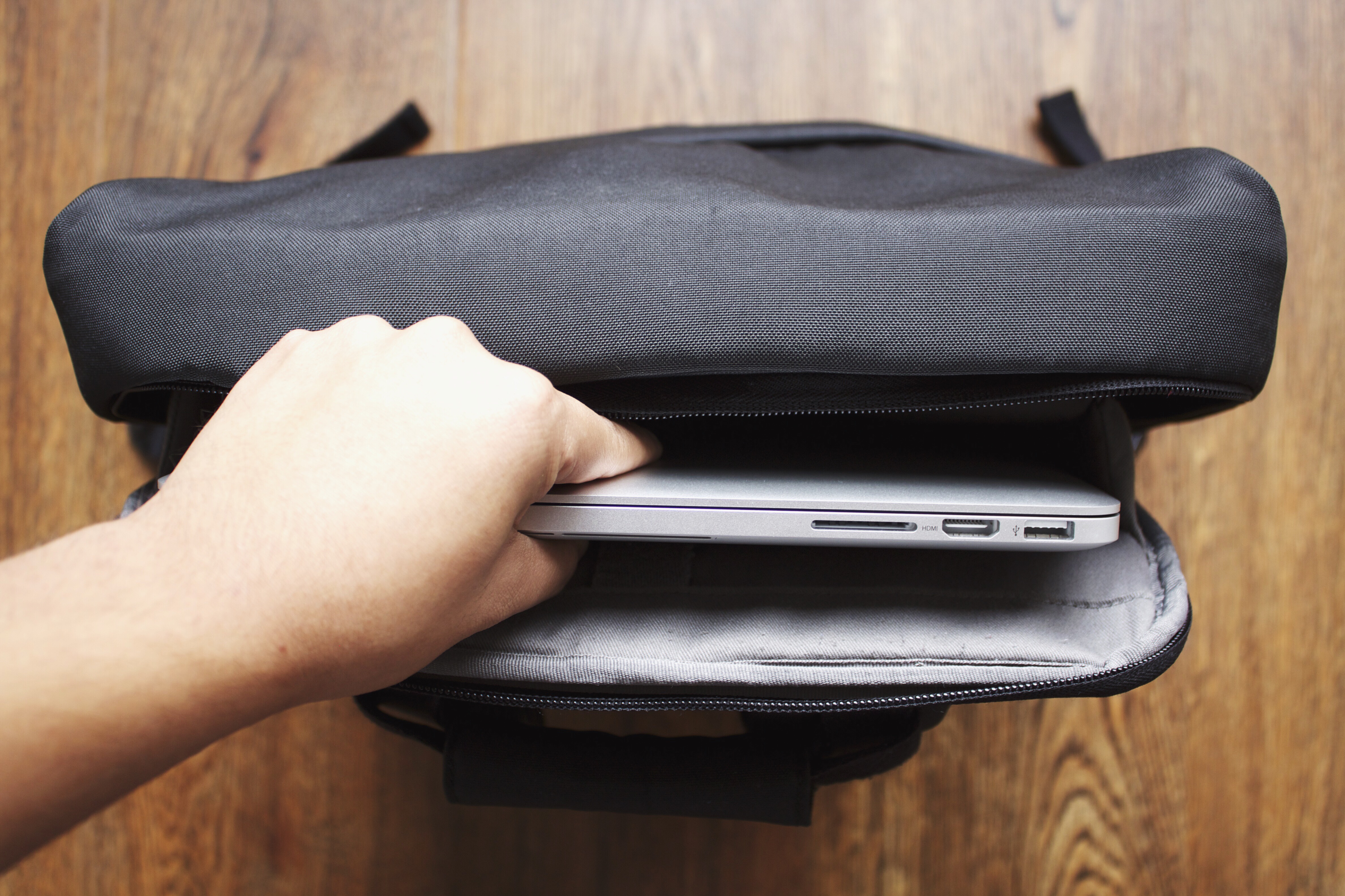
The MacBook Pro just weighs in at about 2kg (about 2 first-generation iPad Airs) and it seems almost non-existent carrying it around in a backpack. It’s amazing to have such performance and beauty weigh less than the iMac I’ve been working on for years. The advancements in technology is amazing.
A note on performance: the powerful NVIDIA graphics card, Core i7 processor and the SSD Flash Storage combined within makes this laptop such a powerful beast. Editing and exporting video, managing dense photo libraries (via an external SSD drive) and playing games at full graphics settings feels and flows like a breeze (and no hiccups so far).
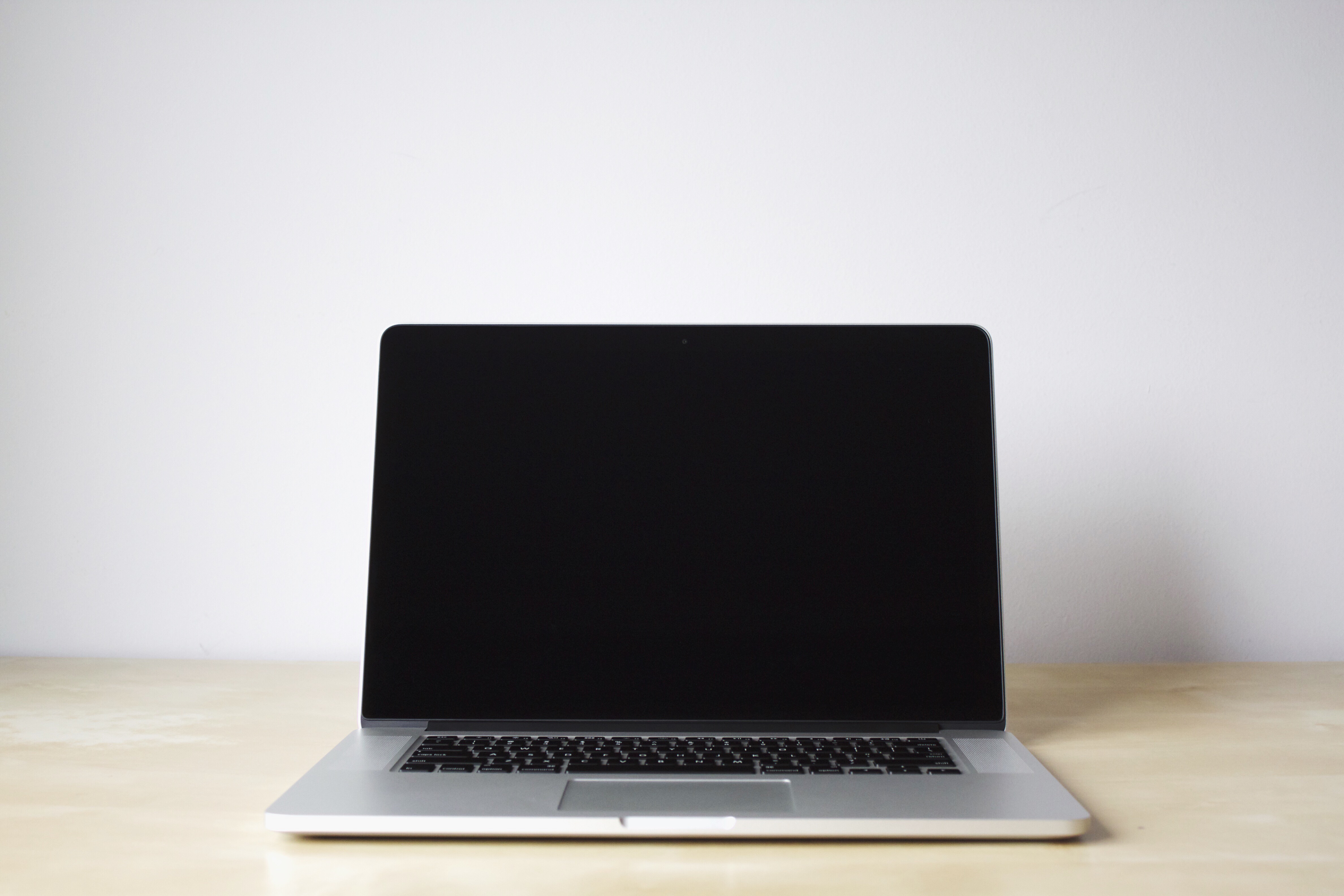
The MacBook Pro has become the archetypal laptop that many PC manufacturers strive to create. It’s an incredibly versatile powerhouse within a sleek, modern and minimal refinement of the classic unibody aluminium design. It’s a distillation of what Apple stands for — and it is the laptop I’d use for years to come.