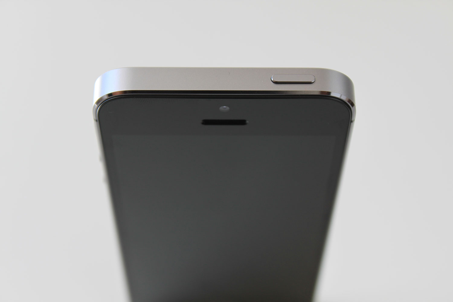
The iPhone 5S
This thing is gorgeous.
Early this year, Apple gave the world an intro to iOS 7.
I called it flat — I harshly criticized its design, its look, and Apple’s overall concept of change. I hated it enough that I was willing to ditch the iPhone and switch to another device. I even pre-emptively decided to get the Lumia 920.
But that was a mistake. And I only realised that after this came out.

If I walked into a store, and had a choice on spending half a year’s worth of personal savings on either the Lumia 920, or the iPhone 5S — I’d pick up the latter without even looking at the former.
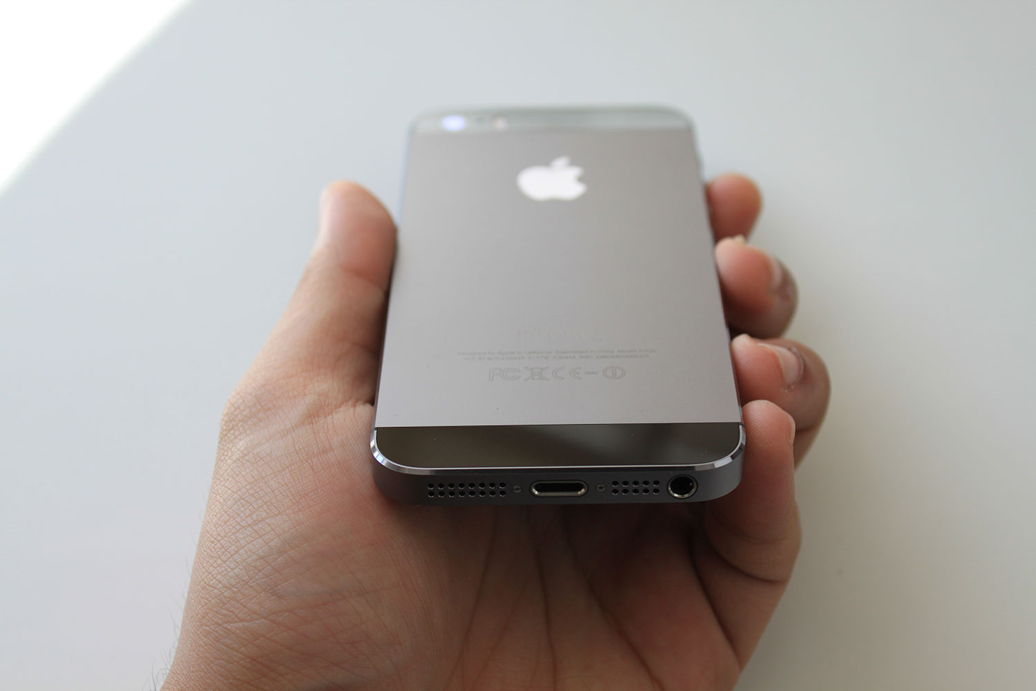
And that’s what I did. A day after launch day, I picked up the ‘space grey’ model. The store ran out of the gold and silver models, and I was told that the 16 and 32 GB models were sold out. I was impatient, so I took what was left.
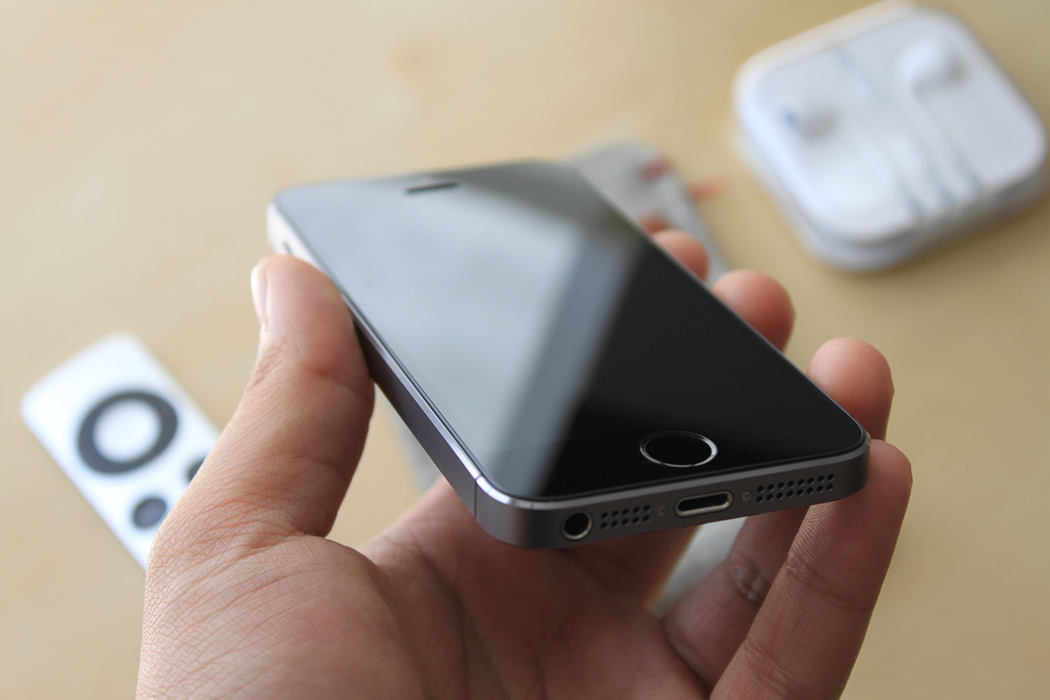
64GB in a slab of aluminium and glass. And did I say this thing was gorgeous? Because it is gorgeous — in fact, I feel that this defines gorgeous. The space gray model, especially (I think it’s the best of the three available).
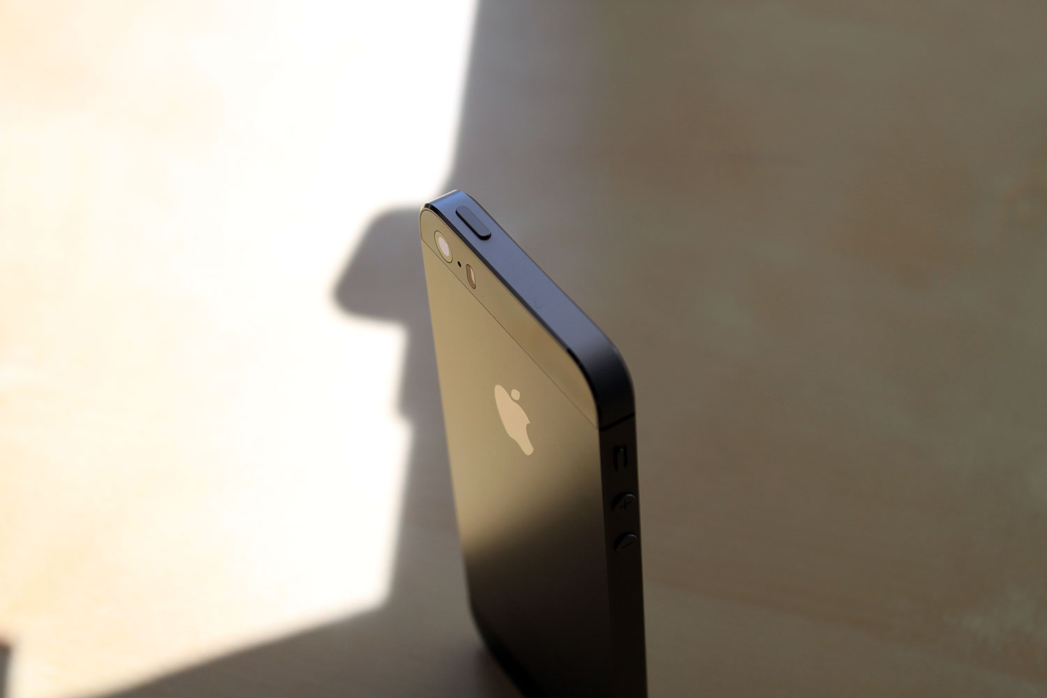
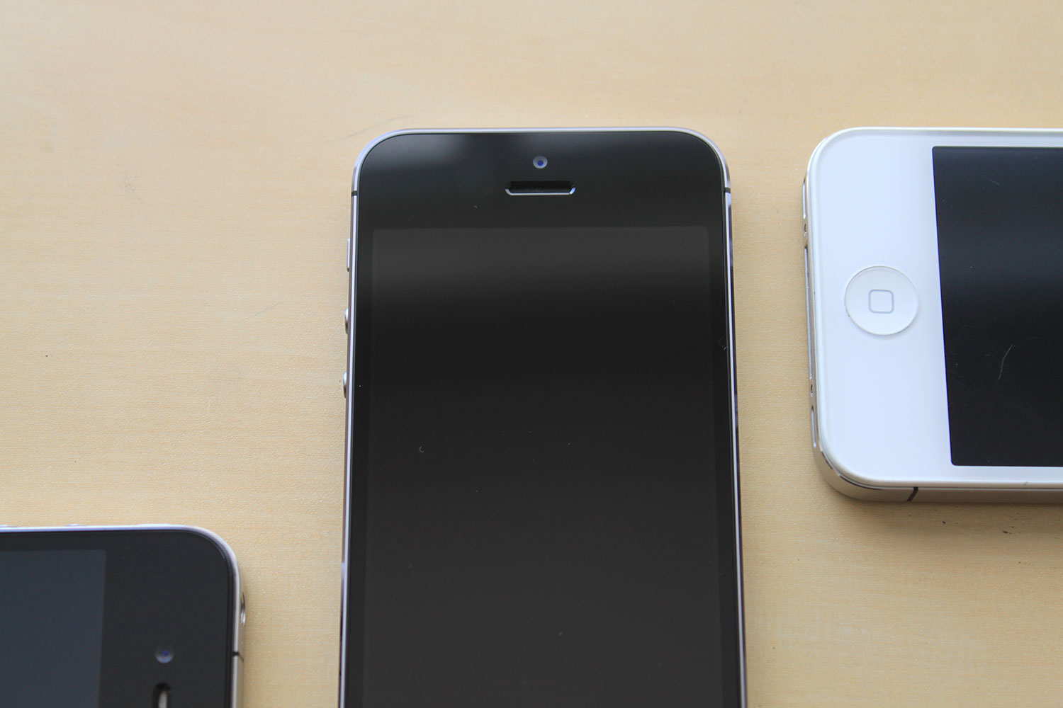
From afar, the space grey model suffers from its disguise: it’s almost like the original iPhone 5. But close up, it’s an entirely different facade: aside from the new home button, the iPhone 5S’s new chamfered edges are more silver and steel-like, akin to that of the original iPhone 4’s sideband lustre. Because of this, the 5S looks and feels more premium compared to that of the original iPhone 5.
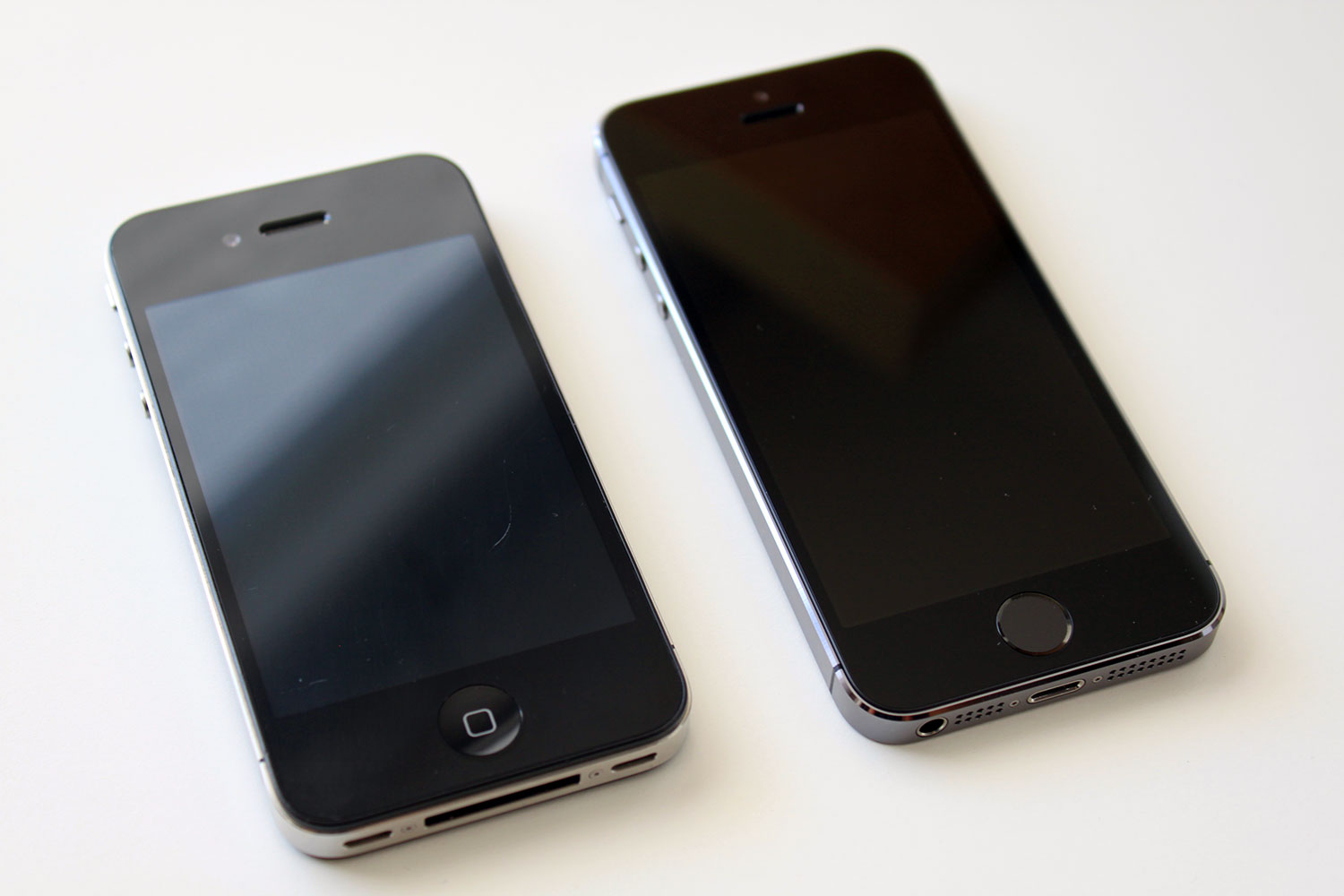
And the hardware’s just one aspect of the 5S; the software’s where it’s at.
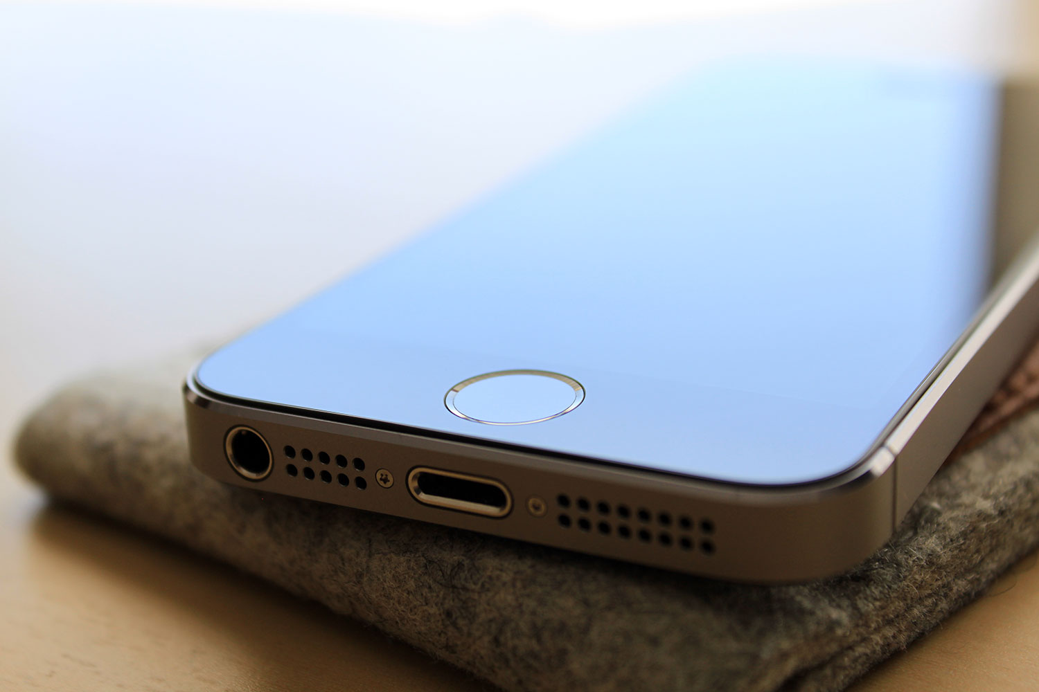
The 5S’s new tout-worthy feature is the fingerprint sensor — which Apple calls the “Touch ID” sensor. Setup is fun, and once you’ve got the phone to register up to 5 of your fingers (I did: one for each of my thumbs and index fingers) using Touch ID becomes a breeze.
And when I mean, ‘a breeze’, I really do. Clicking the extra-clicky home button with the screen off opens the lock screen, and in just a second, the device unlocks like magic.
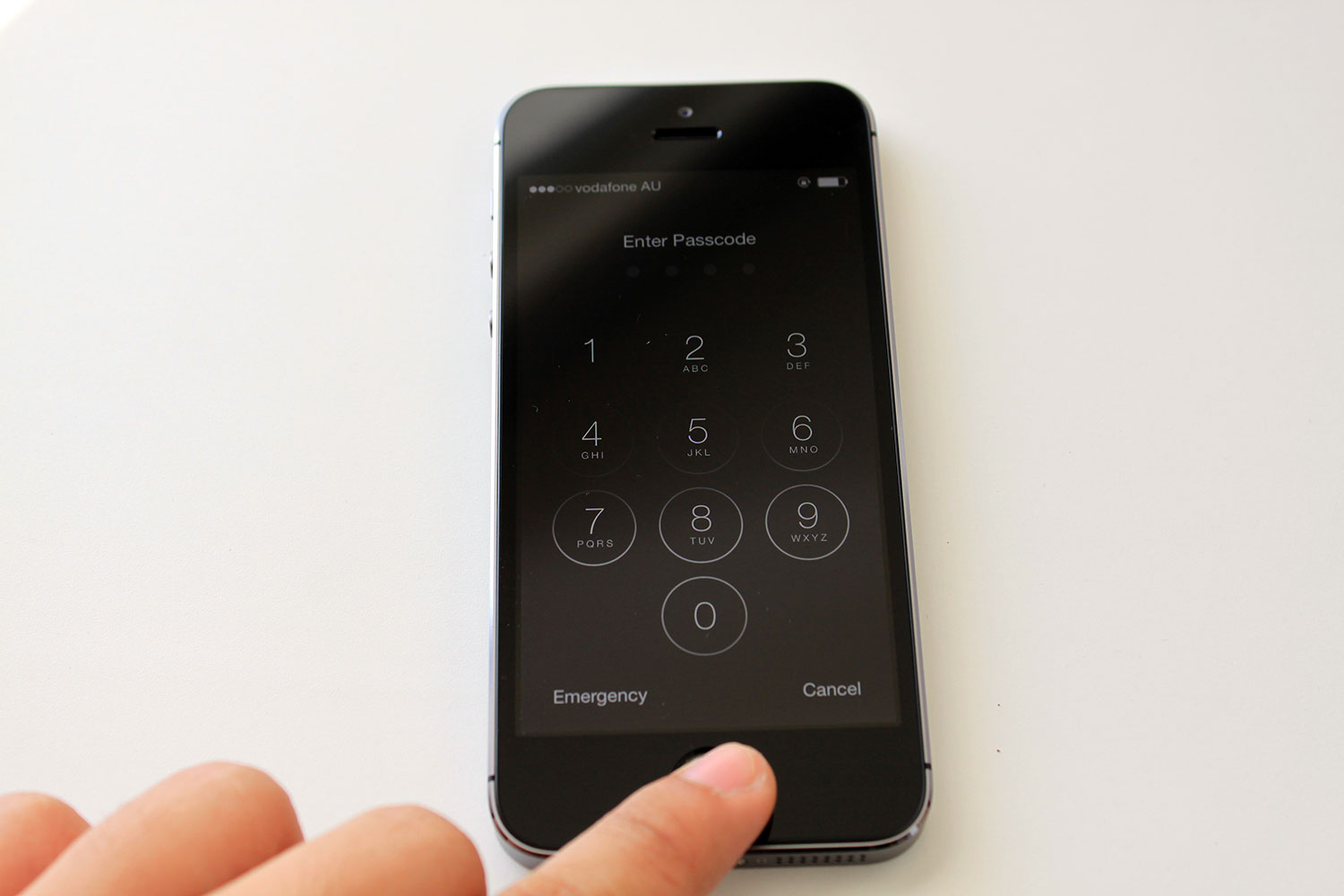
This thing is black magic. What’s even more evil is that Apple increased the size of the passcode buttons to unlock the iPhone with — and those with the Touch ID sensor can hold their nose high as they can do the same, but instead only with the click of a button.

Unlocked, the 5S shows another side of the story. iOS 7 is new: it looks new, works new, and at the same time, makes any iOS device feel brand new. But not with the 5S: if Jony Ive screams the fact that hardware and software should be harmonious — he’s lying. iOS 7 feels just as clunky as it did generations before, and does not play well with the hardware’s premium form. It’s all in all just a whole new skin.
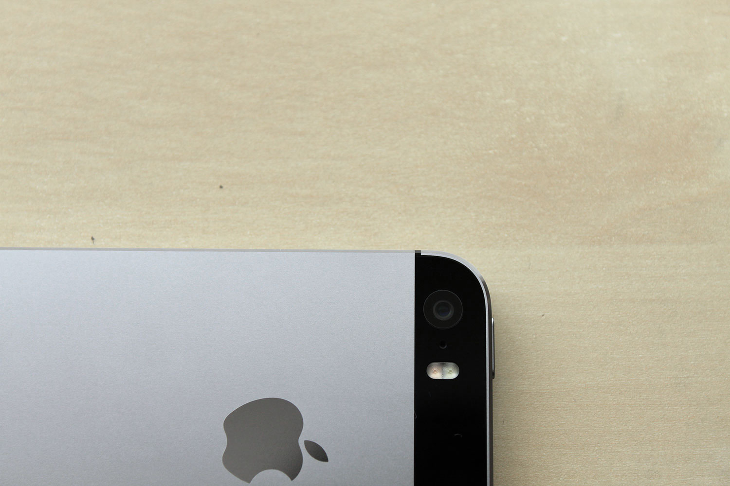
But things are different, to an extent. Safari feels nicer. Siri is sassier. Typography is richer. Animations are sweeter. And then there are the sour ones: icons are coloured wrong, apps are missing classic features and (in my opinion) the camera app is uglier.
But with the iPhone 5S, photos are much better than before. Having used an iPhone 4S for two years (one of the best iPhones ever created, one of the last Steve designed) where the camera quality is already substantial — the iPhone 5S, is a significant improvement.

The unedited photo above was taken with the 5S. Crisp, sharp, real — the things I look for in a photo.
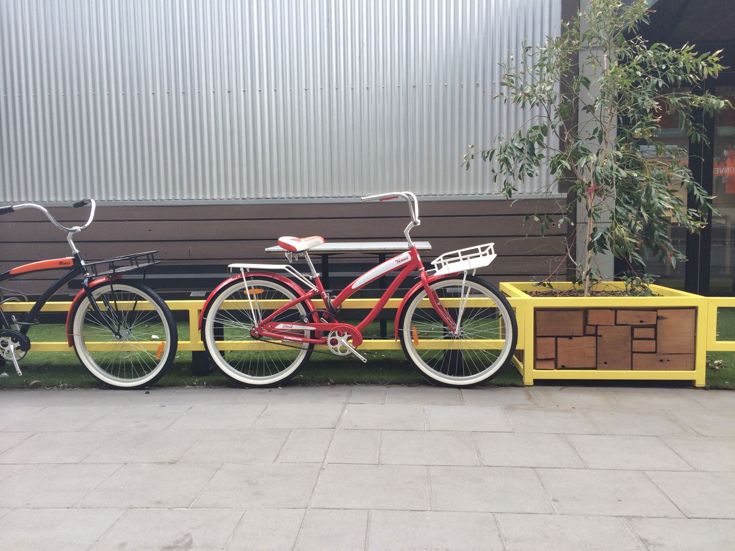
Another one. (And there’s more on Instagram.)
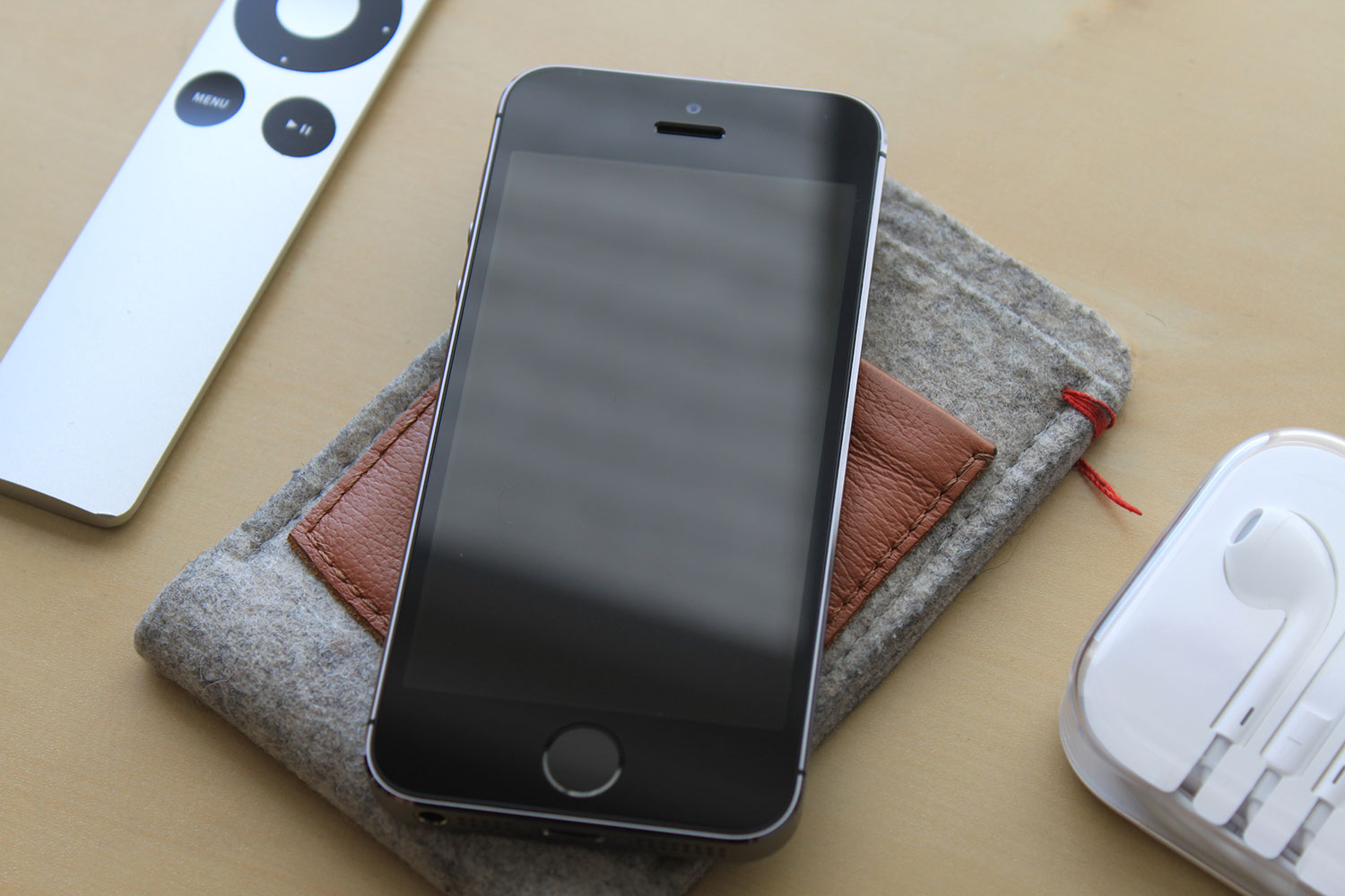
According to market researchers, the 5S outsold their cheap-looking, plastic counterparts, and there’s no other thinking as to why that happened at all. All in all, the iPhone 5S is a purely gorgeous device.
For a device that I’ll be using for the next couple of years, I’m quite proud to have spent what I earned for. (And if I was given the gold instead of the space gray, I’d end it here saying that it’s worth its weight in gold.)